TROY Design Guidelines
TROY's design guidelines provides a comprehensive design system for logo usage, colors, fonts, and iconography, ensuring consistent and cohesive branding. This guide shows users on how to appropriately utilize these elements to establish a strong and unified visual identity for TROY.
Logos
Logo build
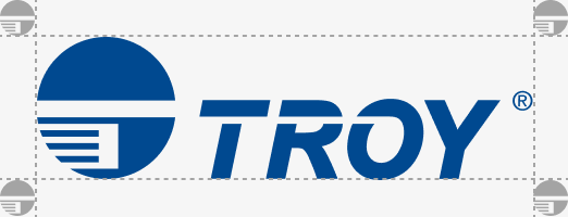
The TROY logo comprises of two elements, the symbol and the type. The symbol is powerful and evokes our culture of excellent service, industry leading dependability and continued innovation.
The typography has been carefully chosen for its uniqueness and effective style. The typeface complements the logo symbol perfectly together creating a very balanced and memorable logo.

Logo usage
Third party companies may only use our logo under limited circumstances and must always be pursuant to the specifications listed here to identify the TROY brand, products and services. Any use that falls outside of these specifications is always strictly prohibited.
Using the logo variants on this page are the only official versions of our logo. The use of any unofficial logo is not permitted. This undermines the logo system and brand consistency. All of the logos are available.
Please consult with TROY Marketing if you have any questions about logo usage or need access to the logo files.
Logo clear space
The area that surrounds the logo is as important as the logo itself. This area is refered to as “clear space” and provides breathing room to the logo and eliminates visual clutter (text, graphic elements or other logos) that can compete with logo legibility - thereby diminishing the effectiveness of the logo. The clear space required around the logo is identified by 20% of the symbol height.
It’s important to keep marks clear of any other graphic elements. To regulate this, an exclusion zone has been established around the logo. This exclusion zone indicates the closest any other graphic element or message can be positioned in relation to the logo. They have a fixed relationship that should never be changed in any way.

Logo minimum size
The TROY logo can work on a variety of sizes and applications but be sure to always consider the size and readability when placing the logo as the size should never be smaller than recommended as listed here.
Print: .55” width
Digital: 52px width
Colors
Primary colors
Black
#222222
Grey
#5b5b5b
White
#ffffff
Secondary colors
Light grey
#f6f6f6
Used as a background color for dividing sections of a webpage, email, datasheet, etc.
AssurePay Green
#17c371
Used draw attention to important details while advertising TROY AssurePay Teller.
FlexPay Green
#47b316
Used to draw attention to important details while advertising TROY FlexPay.
Light Blue
#0096d6
Accent color that can be used across the entire TROY brand.
SecureDocs Orange
#f58426
Used to draw attention to important details while advertising TROY SecureDocs.
Red
#cf5459
Accent color that can be used across the entire TROY brand.
Gradients
TROY + HP
#004990 #0096d6
Used to draw attention to important details across the entire TROY brand.
AssurePay Teller
#004990 #17c371
TROY FlexPay Green
#004990 #47b316
Used to draw attention to important details while advertising TROY FlexPay.
AssurePay Check
#004990 #0096d6
Used to draw attention to important details while advertising AssurePay Check
TROY SecureDocs
#004990 #f58426
Used to draw attention to important details while advertising TROY SecureDocs.
TROY Locking Printers and Security Toner
#CF5459 #47b316
Accent color that can be used across the entire TROY brand.
60/30/10 Rule
When using color across the TROY brand and products always keep in mind the 60/30/10 rule. The dominant color should be used 60% of the time, followed by 30% should be the secondary color or texture and the last 10% should be an accent color.
60%
#FFFFFF
30%
#222222
10%
#004990
Typography
Proxima Nova Condensed
The condensed version of Proxima Nova should be used sparingly, mostly for important headlines. Treat it like a display font for short punchy headlines, and always keep it in all caps.
Iconography
Tabler Icons
Use Tabler Icons across the brand. If icons are not available through tabler, additional icons can be created following the same design style to maintain consistency across all icons.
